Prior to the integration of sound, movies often displayed text-based information using title cards or intertitles. This form of communication is known as diegetic content, as the actors cannot see it.
However, even after the invention of the talkie, other types of information needed to be displayed — such as translations for a foreign audience. This was usually done in a very perfunctory way, with non-descriptive text (typically achieved using a font such as Times New Roman, with a black outline to contrast with any background) on the lower third of the screen. This text is external to the story, so it seemed natural that it should be stylistically different.

In more recent years, there are increased demands on visual storytelling – small screen devices (e.g. mobile) and computers have started to become part of the language of cinema (and, by extension – the video and digital screens on which they are ‘projected’). Additionally, in today’s more multicultural world, the requirement to show multiple languages within the same film means that different typographic techniques can be used to enhance this aspect of the story. In fact, this is an extension of traditional subtitles – where often sound effects and untranslated languages are still included.

As mobile and internet technology started to appear on screen, an editor would typically cut to a shot of the device — allowing the viewer to read the display. As post-production technology improved, TV’s requirement for an increased speed of plot exposition, and product placement costs (and legal clearances) required a more generic approach, this eventually evolved to show the interface directly incorporated onto the visual frame.

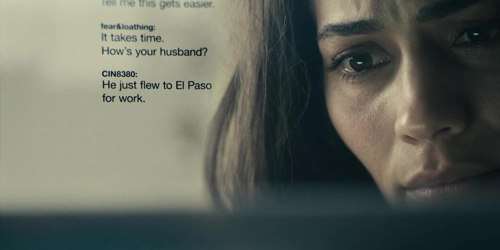
Subtitles, captions and interface design typically sits independently on top of the content as a layer added in post-production – i.e. as a semi-transparent wall between the story and the viewer. Integrating these titles to make them appear part of the content can be quite a technical challenge — especially when they need to be tracked to a moving camera.
This overlaying technique was demonstrated in movies such as Man On Fire (2004), Stranger Than Fiction (2006), Disconnect (2012), and 2014’s The Fault In Our Stars, John Wick, and Non-Stop, as well as TV shows such as (perhaps most influentially) Sherlock (2010) and House of Cards in 2013.
There are two main types of elements in modern cinema: diegetic – anything that the characters would recognise happening within their world (of the narrative story) and non-diegetic – anything that happens outside the story (for example, this would usually be opening credit sequences).
However, (much like modern media itself) on-screen typography has surpassed merely being integrated visually into the background plate. It is now becoming increasingly self-reflexive, and blurs these diegetic lines. This is often referred to as “breaking the fourth wall”, and is perhaps best demonstrated in the opening titles to the 2016 film Deadpool, where even the actual names of producers are subverted into narrative elements.
For more exegesis of the diegesis (sorry, I couldn’t help it), see Tim Carmody’s excellent 2011 SVA Interaction Design presentation “The Dictatorial Perpendicular: Walter Benjamin’s Reading Revolution”.
“A fourth wall break inside a fourth wall break? That’s like, sixteen walls.” – Deadpool
0 comments
Write a comment